ValueStocks uses several types of charts in order to easily represent the different data necessary to make a financial analysis.
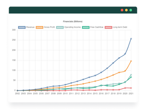
The first chart represents the company's income statement over several years of operations. We can identify income, gross profits, operating profits, and free cash flow. From the first glance, you can already learn a lot about a company. In particular, if the revenues increase over time, if the profits from operations cover the free cash flow and if the free cash flow increases over time.
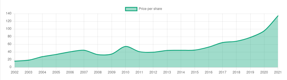
The second chart shows the price per share which tells you the latest price for a single share at the end of each financial year.
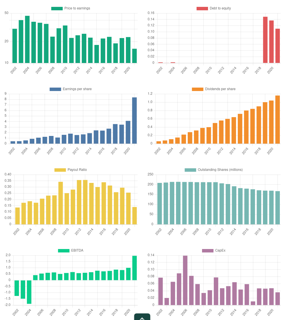
The other important charts are related to financial ratios which helps to track the company performance. These ratios includes earnings per share, dividends per share, price to earnings, debt to equity, EBITDA and capital expenditure to name a few.
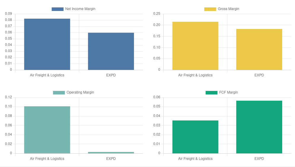
Then we have the industry margins that show the company's margins in relation to its industry.